In 2021, we, Ruben and Sander, started the platform CyclingDestination.cc. In the first period, we focused mainly on valuable content and adding new features to the site. That was a time-consuming activity, but it did result in a nice amount of inspiration articles, travel stories and tips. This year, we are going to add a lot more, including several new itineraries, areas and also material collaborations for which we can create beautiful content. So it was time for a new logo for cyclingdestination.
Next step
As we create more and more content ourselves, we thought it would be cool to have a logo created that really suited us. But then again, what really fits? And how do you do that? In the end, with Ramon we were able to create a cool design that incorporates a nice number of elements that also fit CyclingDestination! But what's all hidden in the new logo for cyclingdestination?
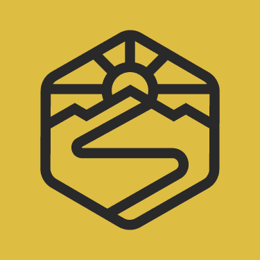
Sun, mountains and the road ahead
The logo tells much more than just a sun and some mountains. The way up forms an abstract letter 'C' and 'D', which is kind of cool. Also, the sunbeams are inspired by the spokes of a wheel! We hadn't immediately seen those either. The mountains and the sun are also nicely balanced. We are extremely happy with that. Who knows, you might soon also find this logo on cool merchandise or in another form. In any case, it is another step in our development. We will continue to communicate about our plans and are happy to take you along with us!